I am somewhat particular about the aesthetics of what I use and make. As part of my journey to fully understand the ins and outs of operating a GitHub pages website, I wanted to give it a fresh coat of paint using one of my favorite fonts, Questrial.
I first came across this font when I was browsing the catalog of music of a French label, Ultimae Records. Run by Vincent Villuis (who releases as AES Dana), the label specializes in cinematic, professionally mastered electronic music releases with impeccable visual design. I own a sizeable chunk of their releases on CD. As part of their visual overhaul in the latter half of 2017, their font of choice for releases and their website was Questrial. This is a very beautiful typeface with a few quirks (like the “j” character lacking a bottom curve) but is nonetheless readable and elegant for most purposes. It also neatly matches my resume, which sacrifices some professionalism for a very clean and unique look.
Adding this font to the website was simple.
- I first needed to load Questrial using its Google Fonts URL into
_includes/head.html.
- Edited
_sass/no-style-please.scss to have body (the only type of text this website uses) = Questrial.
- Added the lines
body { font-family: 'Questrial'; } and h1, h2, h3, h4, h5, .site-title, .site-nav { font-family: 'Questrial'; } to the file assets/css/main.scss.
- Finally, I modified
head.html to load main.scss after the Questrial font was loaded, and the font successfully displayed on the website after deployment.
To stylize the code font used above, I wanted to use Ubuntu Mono from the eponymous Linux distribution. I’ve been using it as my VSCode editor font ever since I learned how to customize the IDE in high school. Loading it in and ensuring the “code” style of text uses it mirrors the first four steps above.
]]>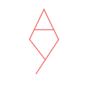 In 2020 I decided to stylize the monogram further, this time removing the “stem” of the Y and turning it horizontally to simulate the curvature of a lowercase “y.” The upper portion of the monogram was squared and leveled off, taking inspiration from the Chinese character for the sun, 日 (rì). The resulting monogram was pleasing to the eye and easy to fit in the corner of most of my sketches without being obtrusive.
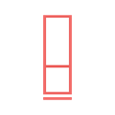 Around 2021 I started posting to a now-defunct art account on Instagram using a Google Slides-created digital watermark, shown below. I made sure that the borders and lines were of equal width.
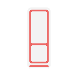 It has been a few years since I’ve been actively sketching in any major way. However, I’d never let this logo go to waste, and I decided to revisit it to design a custom favicon for this site. I blew up the proportions to a square, thickened the lines somewhat, and patted myself on the back.
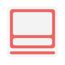 Of course this logo seems decent at such a large scale, but when squeezed into a favicon in your tab it becomes rather hard to read. I decided to optimize it further to display at 128x128 or lower resolution. I don’t know how to properly tune radial curves and translate smooth objects to the pixel scale, but this one looks decent for now.
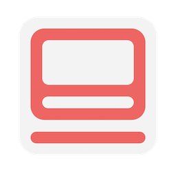 I really need to learn how to use real graphics software.]]>